In outland, the player controls a nameless man whom can utilize two separate powers to fight evil. The game's foreground is entirely silhouetted and the game has a very visually dark tone to it.
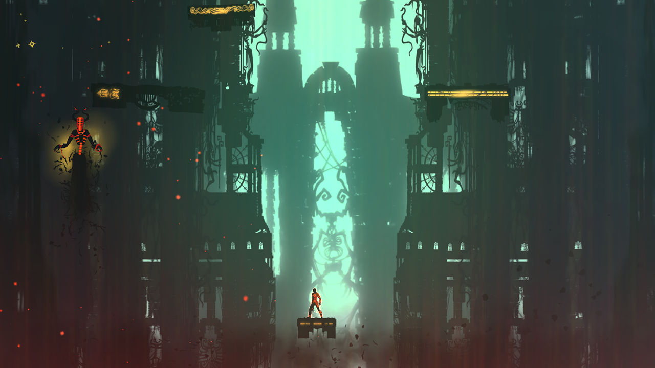
What's interesting in Outland is the use of the powers. as the player progresses, they gain the ability to embody either the blue or red power, Blue power is needed to kill red enemies, and vice versa.

It's really cool how generally only tiny, very bright amounts of colour are used, and their use is entirely functional navigation. Just as accent colours in a painting lead the eye around the image, the colour use in Outland is used to immediately impart information pertinent to your survival, info like;
There is an enemy over there (signified by the small, but very bright colour accent)
That enemy is red (signified by the hue of the enemy)
I need to use blue to kill it. (deduced from the assessment of the monsters allignment.
Thus, Outland manages to use very small accents to direct a player, just as artists direct a viewer.
Interestingly, tiny, bright accents of saturated hue are turned on their head during boss battles, massive creatures glow and fill the screen with colour energy, which after running around in the dark for so long, really impresses on the player the strength and importance of the boss character, thereby imparting some narrative components as well.

No comments:
Post a Comment