Thursday 8 November 2012

Narrative, Entry 2.

As the final video game I will cover on this blog for the foreseeable future, Dear Esther is a game that is positively dripping with emotional subtext, themes of loss, death and loneliness are perpetual companions throughout the game, as soon as the game starts, the barren, long abandoned lighthouse sits cold and desaturated in the fog around the jetty, a Lighthouse unable to shine its light makes for a powerful initial composition.


The lighting chosen for the game is every overcast, dreary day rolled into one. flicks of blue sky barred from breaking the gloom by thick misty clouds. There is a sorrowful quality to the image in its desaturated hues and dreary palette.


The objective of the players journey, the radio tower in the distance on the far side of the island puts emphasis on these feelings, from the abandoned buildings, we can see the solitary red light atop the tower, as lonely as the player, and the players inevitable destination. The bright red accent really stands out against the dreariness of the environment, acting to mirror the players solitary presence on the island. Through just the use of colour, the sorrowful nature of the eventually revealed story is palpable right from the second the game begins.

Narrative, Entry 1.

The mood or 'narrative' of colour composition relates to the human connotations to certain colours and how they are used by an artist to add subtext to what the audience is witnessing.

for example, a character bathed in blue light is more likely to seem sad or lonely than a character well lit by midday sun, This is because we sometimes associate the colour blue with sadness and lonliness, a solitary figure under soft blue light connects the dots in our minds for us.

Conversely, We have natural responses to colour as well as emotional responses. For example, Bright vivid accents of hue's like red or orange tend to denote danger. toxic/dangerous animals use this colour in the wild, and we are conditioned to feel alarm when we encounter these hues when used correctly. Another Association to red and orange is of course fire, a truly primal fear. A character standing alert in a corridor with red lights flashing on and off overhead obviously denotes danger or a need to defend or escape the situation (the fight or flight response.)

Complementary to these 'alert' responses to colour, human beings also have positive or calming responses to colour, for example, Green is a colour that instinctively signifies safety and calm. From our tree dwelling ancestors, we have inherited a 'calm' response to shades of green.

Artists can use these responses to colour to impart additional contextual information about the emotional state of characters or the nature and 'mood' of a newly introduced environment.

With the principle explained, it's time for some examples.

Proportion, Entry 3.

For my final entry on colour proportion, I want to examine the PSN title Outland.

In outland, the player controls a nameless man whom can utilize two separate powers to fight evil. The game's foreground is entirely silhouetted and the game has a very visually dark tone to it.

What's interesting in Outland is the use of the powers. as the player progresses, they gain the ability to embody either the blue or red power, Blue power is needed to kill red enemies, and vice versa.

It's really cool how generally only tiny, very bright amounts of colour are used, and their use is entirely functional navigation. Just as accent colours in a painting lead the eye around the image, the colour use in Outland is used to immediately impart information pertinent to your survival, info like;

There is an enemy over there (signified by the small, but very bright colour accent)
That enemy is red (signified by the hue of the enemy)
I need to use blue to kill it. (deduced from the assessment of the monsters allignment.

Thus, Outland manages to use very small accents to direct a player, just as artists direct a viewer.

Interestingly, tiny, bright accents of saturated hue are turned on their head during boss battles, massive creatures glow and fill the screen with colour energy, which after running around in the dark for so long, really impresses on the player the strength and importance of the boss character, thereby imparting some narrative components as well.


Proportion, Entry 2.

For my first study of colour proportion, I will be taking a look at a piece of work by Alphonse Mucha, Namely, 'Job Cigarettes'.


An interesting constant in much of Mucha's work are the warm, honey-like hues Mucha uses not only for skin, but also spill into the aesthetic elements of the posters construction, this can be seen in the boarder patterning and the characters hair.

This honey toned dominant colour is the focus of my initial observations on the piece, The amber yellow hue is clearly the dominant hue in the scene, and whilst it doesn't highlight a focal point in the way an accent would, it uses its large surface coverage to encourage the viewer to explore the details and intricacies of the woman's hair and face. Natural investigation of her features and form inevitably draw the viewer to the cigarette in her hand, the point of the advertisement.

To make the cigarette a focal point, one way to do so may have been to desaturate the whole image, and have the cigarette glow a saturate red colour, or perhaps darken the scene and make the cigarette the light source. Mucha does neither, instead, his subtle method of 'leading' the viewer around the scene bring the message home when Mucha decides you're ready for it.

Mucha has accomplished half his job by now, he has established the cigarette as the theme and motif of the advertisement, all we need to know now is the brand. Mucha accomplishes this simply by using a green font, complementary to the purple hue of the background. Interestingly, Mucha leaves nothing to chance here either, as if you saw the cigarette in the woman's hand, you saw the trail of smoke winding its way up to the lettering for Job's cigarettes, leading you home and earning Mucha his very well deserved pay.


This piece is interesting as it doesn't use accent's to grab the viewer right away, it instead uses the vastness of the dominant hues to lead you to the focal point. I find it interesting that there are so many different (and very well thought out) ways to direct the audiences attention around your image.

Wednesday 7 November 2012

Colour Proportion, Entry 1.

Colour proportion refers to the amounts of each hue from the colour palette is used in the overall composition. Generally, there are three defined applications for colour in relation to proportion, These are;

1. Dominant colours
2.Sub Dominant Colours
3. Accent colours.

In this order. Usually, an image has a Dominant colour that has the majority coverage within the piece. (A good example is the red room in The Dessert: Harmony in Red by Matisse, which I covered previously here)

The dominant colour helps to control the overall effect of the image, for example, a nighttime scene may have a dark blue dominant colour, to keep the scene's night time setting consistent. Whilst other colour will occur in the scene, even potentially very bright colour, the dominant colour will maintain the setting or 'mood' of the scene overall.

Sub dominant colours are now introduced into an image primarily to describe areas of interest. Sub dominant colours tend to still hold a sizable amount of area coverage within the image, but are always a decent amount smaller than the dominant colours. Their smaller quantity makes sub dominant colours good for highlighting areas of interest for the viewer. For example, our night time setting of dark blue hues may have a small town bathed in yellow light, the area is considerably smaller than the large amount of blue hues in the scene, but the fact it is smaller and different from the blue hues makes it an area of interest and attention.

Finally, Accent colours are colours with vastly contrasting aspects to the colours already present in the image. Be it a saturation contrast, a value contrast, or simply a contrast of hue. These areas of colour are very small, designed to jump out of the image and grab the viewers attention first. The viewer is drawn the the area of highest visual contrast, the accent is designed to fill that role and control the most important focal points and the order they are perceived and read by the audience. Going back to our imaginary image of the small town at night, this could be a lone tree in the town center, with a small, well light shot of bright green leaves, contrasting the blue hues of night around the outside of town, and the yellows of the town itself.

Without well considered Colour proportion, a composition runs the risk of being boring, or bombarding the viewer with too much information at once.

it is especially important in images using Triadic or Tetradic colour palettes, as the large number of strong complimentary hues can cause undesirable clashes in the image, or produce a jumbled mess of colours without proper consideration of which of the strong hues should be dominant.

With the principle of colour proportion explained, let's look at some examples in the next couple of posts.

Tuesday 6 November 2012

Saturation, Entry 3.

In my final post on saturation, I want to examine some screenshots from a game called 'Flower', it is by Thatgamecompany.

Flower is an exploration typed game, although very open ended and dreamlike in nature. the player controls a single flower petal, and through tilting the ps3 controller, the player is able to exert wind force on the petal, blowing it around. As you navigate the area, the petal coming in contact with other flowers and grass has an effect on the landscape, it is this transitional effect that I want to highlight.


Here, we can see the path of the petal, followed by petals from other flowers the player has encountered. We can see the grey and desaturate surroundings untouched by the petal's influence, also. Through travelling through the world, the player brings saturation and visual interest to an environment that originally has next to none.

This is interesting, as the creation of saturate areas becomes an objective and reward for the player, in and of itself.


The saturation, as it is restored to the scene, gives the visuals a feel of familiarity to the player, Nature is 'not' desaturate, it is colourful and vivid, even in simple green plant life, the shades and hues of green are myriad and varied. The desaturate world, before the petal begins its work of transforming it, is a somewhat uncanny representation of nature, we know the shapes and forms, but the lack of saturation seperates the world of 'Flower' from what we know nature should be.

Interestingly, as the game advances, we begin to see more and more of another kind of world, namely, the human world.


A visual theme is made as nature encounters civilization. even when touched by the petal's influence, the man made environs change little, they become a little brighter and cleaner, but really, the mundane is inseperable from the structures. The player works around this, weaving colour and nature amongst the man made structures.

It's very impressive that the game is able to tell a story just through the use of saturation, and in tandem, the lack of saturation. Just as images use contrasting saturation levels to impart information and draw our attention to various parts of its composition. 'Flower' uses this same device to draw its open ended narrative to a close. 'Flower' is in my opinion, the embodiment of the power of colour and the understanding of it, and what we are able to do when we fully understand its application and implementation.

Monday 5 November 2012

Saturation, Entry 2.

Taking a break from 'professional' works and AAA video game's for this entry, I want to focus on a free, independently made game by a internet user known only as 'Mortis Ghost'. The game, originally released only in French, has garnered much acclaim for its atmospheric style and intriguing art direction.

The game's name is 'Off'.


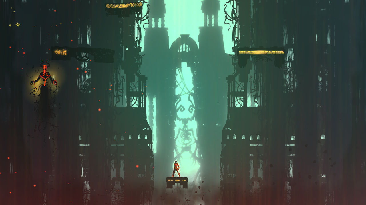
Here we can see a screenshot of the battle screen. The player controls a mysterious character called 'the batter', and is accompanied by an even more enigmatic, apparently somewhat sentient object known as 'Alpha' (the spherical ring, also pictured right.)

Across from the players team, on the left we see some randomly encountered enemies. What is interesting in this screen, and in the game overall, is the use of saturation for the purpose of representation. The batter is dropped into this world with the task of 'purifying' it. Of particular note is that the player character is completely desaturated and monochromatic. As he succeeds in purifying each zone of the games world, the zones lose their colour entirely, and become white too.

With this in mind, it is curious to see that the enemies in this world are also monochromatic. This brings up contradictions and questions in the viewer as they play. Is your character somehow affiliated with the strange monsters he battles?

Colour is treated as the overarching enemy of the batter, He seeks to purify the world and remove that colour, however the enemies he faces are not colourful themselves. this draws questions on the Batters real motivations.


As the game draws towards the end, it is revealed that the batter is somehow connected to the controlling inhabitant of the world. 'The Queen' of all he has fought is his wife, after defeating her, he ventures to the core of the world, where he finds what is implied to be his infant son. the player is then forced into a combat screen and must fight the child, it offers no resistance and is killed. The official ending has the batter heading to the back of the room, and despite his guides insistence that what is happening is wrong, the batter flips a switch, turning off the light. The game then ends.

It becomes apparent that the batter chose to eliminate everything in the world, the people in it, the colour, even the light, and shut everything down. The story seems to indicate the breakdown of a marriage through its diologues, but that is largely unimportant in this post.

The use of colour is interesting in 'Off' because the symbolism of saturate colour changes as you play, 'purification' initially sounding to be a noble goal, is in fact the annihiliation of all, good or bad. Saturation starts to seem less of a bad thing or something to defeat.

Another interesting theme in terms of the desaturation of the purification process, is that purified zones are not free from enemies. if anything, the enemies that inhabit areas the batter has already purified are even more grotesque than those in the regions of colour.

Enemies encountered in a 'purified zone'.


I find it interesting that different saturation values become 'characters' themselves in 'Off', and are symbolic of a powerful emotional journey that often takes reams of dialogue to tell.